A Reviewer's Guide to Understanding Graphs - the B&K 5128 Edition
The introduction of the B&K 5128 measurement system heralded a revolution in the headphone hobby with our visualization of frequency response graphs. But how does it compare to the old GRAS standard and how will calibrated graphs improve our understanding of measurements? In this article, we break it all down for you.
Introduction
If you’ve been following along with us over at The Headphone Show on YouTube or read some of our recent articles here at The Audio Files, you’ll undoubtedly have seen us discuss a new standard for frequency response graphs based on the new B&K 5128 measurement rig. It’s an exciting time for the hobby as improved data helps us all better understand our listening experience.
But the shift to the new B&K 5128 system has been a little complicated, to say the least. Not because it’s hard to get good graphs, but because it’s tricky to make sense of it. After all, we’re talking about a paradigm shift in the way we look at graphs and understand them. I’ll be honest, even as a reviewer I myself have been confused at certain times, especially as we learn more about these measurements and the best ways to present that data.
So with that, today’s piece is meant to help clarify and tie everything B&K 5128 related together in an easy-to-read article. I’ll be going over how we’ve read graphs using the old GRAS 43AG standard, our current understanding of B&K 5128 graphs, and what’s up with compensated graphs, target curves, tilts, and preference boundaries. You can read this article from start to finish as a full walkthrough in how to read graphs if you’re totally new to the hobby or skip to the sections discussing the B&K 5128 as a quick brush-up.
Note that this won’t be the first or last article here discussing these topics. Fellow reviewer Listener put out a very comprehensive article with similar themes as it relates to IEMs and our in-house audio engineer Blaine will be putting out a more technical deep dive in the future for those who really want to get into the nitty gritty nuances of measurement academia.
The GRAS Standard
If you’re totally new to headphones and what measurements even are, you’ll want to read this part. If not, you can skip the next two sections as I’ll be walking through the basics of frequency response measurements. But it might be a good idea to read it as a refresher to brush up some terminology.
Have you ever heard a headphone be called V-shaped? Or bass boosted? Bright? Warm? Sharp? Neutral? These terms are ubiquitous when talking about sound in general. But for headphones (and other audio gear), we can actually visualize what it means to be bright or warm or bass-boosted. We do this through something called frequency response graphs where we use specially made microphone set-ups to measure the sound of a headphone.
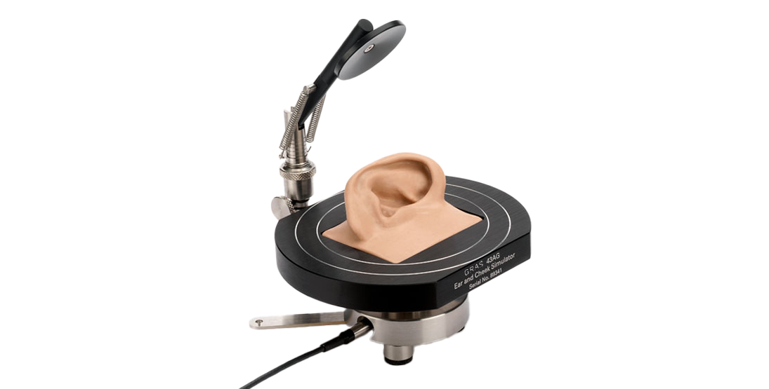
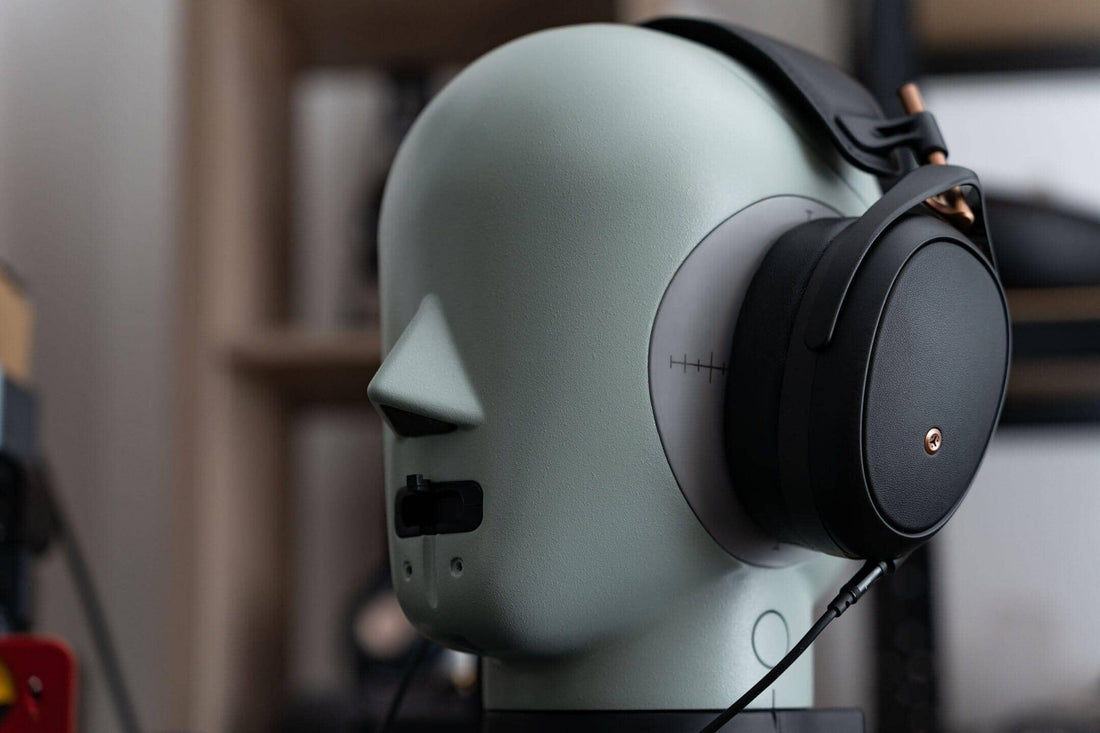
For headphones and in-ear monitors (IEMs), the majority of frequency response graphs you’ll see today are based on measurement rigs that follow the IEC 60318-4 specification (formerly known as IEC 60711 or “711”). These rigs are generally referred to as GRAS rigs. For example, the GRAS 43AG system that we use here at Headphones.com. A key reason for its ubiquity is the existence of clone microphones collectively known as 711 couplers that allowed many hobbyists to take reasonably accurate measurements at a fraction of the cost of an official GRAS system, particularly for IEMs.
While more accessible measurement systems at a lower cost is only a good thing for the hobby, it’s important to keep in mind that not all clone couplers are the same. And not all measurements done on clone couplers can be compared equivalently to measurements done on official GRAS standard rigs. This applies to both the various physical ear models being used with these clone systems as well as for the coupler microphones themselves. Thus, for the most consistently comparable measurements, you’ll still want to use graphs from industry standard rigs.
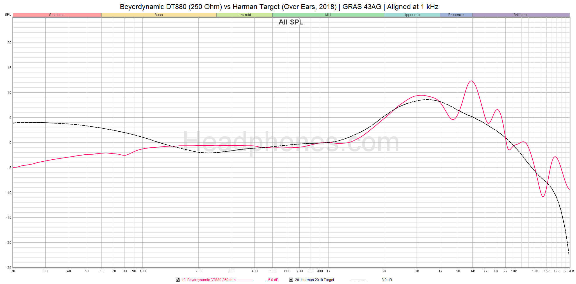
Here’s what a raw frequency response graph actually looks like using a GRAS 43AG rig. As with any figure, there are three things you have to do to understand what you’re looking at:
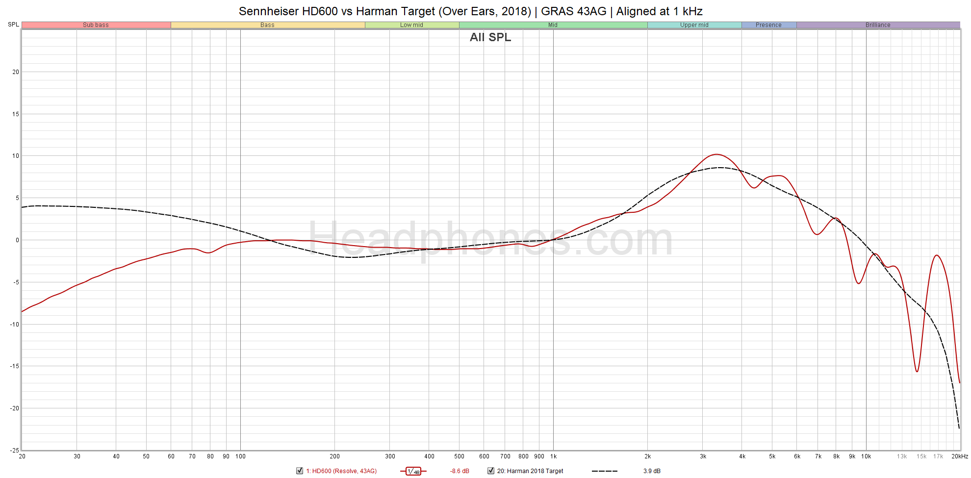
Classic view of a raw headphone measurement. The Harman target here is the 2018 version.
-
Read the title. Here we have the legendary Sennheiser HD600 vs. the Harman target, aligned at 1 kHz. This tells us what the graphs are comparing.
-
Read the axes. The X-axis is 20 Hz to 20 kHz, the range of human hearing. The Y-axis is Sound Pressure Level (SPL), representing how loud the headphone is at any given frequency between 20 Hz - 20 kHz with a range between 65-115 (50 dB). 50 dB gives us a reasonable range to see the differences between graphs without blowing them out too much. Together, these are what gives us a frequency response graph. Keep in mind that these measurements are not accurate in the upper treble past around 8 kHz.
- Read the legend. The red line represents the Sennheiser HD600 while the dotted black line is the Harman target.
The closer the red line is to the black line i.e. the closer the HD600 is to the Harman target, the closer it is to a “target” curve. We can see that compared to Harman, the HD600 lacks subbass as it starts to fade out below 70 Hz. It has more energy in the midbass/lower mids region and beyond that, the HD600 lines up very nicely with the target curve. Thus, the HD600 has a very neutral, reference-like tuning that can be considered to be on the warmer side because of that midbass/lower mids elevation. Once again, when compared to the Harman target.
The first obvious question you might be asking is: Why is it NOT flat? After all, isn’t a flat sound the best? Yes and no. The idea of flat sound comes from ideal speakers in an anechoic room. With headphones, that mountainous peak around the 2 - 3 kHz region in the upper mids is essential. That’s because our bodies actually influence sound by the time it hits the eardrum. Specifically, for headphones and IEMs, it would chiefly be the ear canal and outer ear (pinna) as they’re right at your ears. Adding up all these factors gives us something called the head-related transfer function (HRTF). Note that we could make this graph look flat by looking only at the difference between the HD600 and the target. That is known as a compensated graph (or in some cases, calibrated. More on that later).
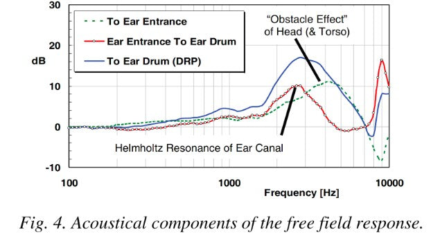
Illustration of how the different parts of the body shape how sound reaches your eardrum. The green dotted line represents everything external to the ear (head and torso). The red line is from the ear to the eardrum. The blue line represents the combined effects and gives us a head-related transfer function (HRTF). In this case, it is the free-field response. Different HRTFs exist based on how and what you’re measuring; the Harman target is a different HRTF. Credit to Struck 2013.
The second obvious question you might be asking is: What is the Harman target and why is it considered a “target” curve? This starts getting into more technical literature but simply put, Harman Research is an academic group that led some key studies trying to understand what kind of frequency response listeners preferred in headphones. The Harman target (specifically, the over-ear target) is the fruit of that research. The most important point I want to make here is that total adherence to a target curve does not absolutely indicate sound quality. It gives you a good idea of what the sound is like but not what it actually sounds like since… you actually have to hear something to know. Not to mention that everyone has their own subjective tastes of what good sounds like or what they enjoy which is why some headphones don’t measure perfectly but plenty of people love them.
Keep these points in mind because I’ll be expanding on them below when I talk about the transition to the B&K 5128 system.
Translating Graphs to Music
First, let’s talk about what these graphs actually mean when it comes to listening to music. After all, your eyes aren’t your ears. What a frequency response graph most easily tells us is the tonal balance of a headphone. This is what’s commonly referred to when people talk of headphones being warm, bright, dark, etc. “Neutral” is a bit of a vague term but it generally refers to something that follows a reference or target curve. I.e. a Harman-neutral headphone would very closely follow the Harman target throughout the entire frequency response. Deviations from “neutral” is where we start characterizing headphones as warm, bright, dark, etc.
For example, let’s take a look at the popular Beyerdynamic DT880
Note the large peaks in the mid-treble region around 6 - 8 kHz. These peaks are what makes the DT880 bright. Music will have their frequencies emphasized in that region. Thus instruments like hats and cymbals will sound particularly sharp and crisp, sometimes painfully so.
And that leads me into what I think is the most intuitive way of understanding graphs. Look at the graph and see where it deviates from a “neutral” standpoint. Then think of individual instruments that you commonly hear in music that are dominant in that region. How does having too much or too little energy in that region affect how these instruments sound? For example, if there’s a good helping of lower mids around 300 Hz, it’ll make acoustic guitars sound warmer and richer, more bodied. If that peak around 3 kHz seems to be rather flat, vocals are going to sound more relaxed and recessed.
It will take time and practice to understand these effects but a really great tool to help you is EQ. Bump up the bass a bit and listen to how it makes specific instruments like the bass guitar or drums sound. Turn down the treble - what does that do to your vocals? The hats and cymbals? Does it take out some of the brilliance in your music? Or do you prefer that softer presentation? Take your time to explore and build up that intuition to really understand the effects that peaks and valleys will make in your music. There’s a lot more nuance than that but this will give you a good start to grasp what a graph is telling you.
What a graph doesn’t intuitively tell us is some of the more subjective audiophile oriented concepts that reviewers colloquially refer to as “technical performance”. Qualities like soundstage, imaging, resolution, dynamics, etc. that all affect the enjoyment of music. These concepts are likely captured within the frequency response measurement, and the information contained in frequency response relationships are going to be more perceptually relevant than just pure target adherence (or deviation).
But in practice, we can’t easily extract this information from measurements as easily as we can the overall tonal balance because there are endless combinations of frequency responses when at the eardrum. Thus, we have a thriving hobby where people attempt to translate their subjective experience of these qualities in headphones into words in a way that may hopefully be understood by others.
The B&K 5128 Standard
The B&K 5128 is now the industry leading measurement system that every big name reviewer will be using. Why? It gives better data through more accurately simulating the human ear system (especially at lower and higher frequencies) compared to the older standard. The problem is that it costs about $50k so very few reviewers can afford one.
But it will necessitate a major change in the way we look at graphs: we can’t compare to the Harman target anymore. Harman’s research was done using a GRAS system which renders its derived target incompatible with measurements taken with the B&K 5128. As such, we’ve chosen to go with a new representation of frequency response graphs to resolve this issue and address a few other issues that the “classic” GRAS graph has. In many ways, it’ll be a simpler and more flexible arrangement. There’ll just have to be some unlearning of entrenched graph-reading habits.
Without further ado, here’s the graph.
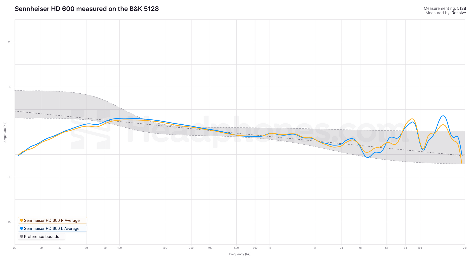
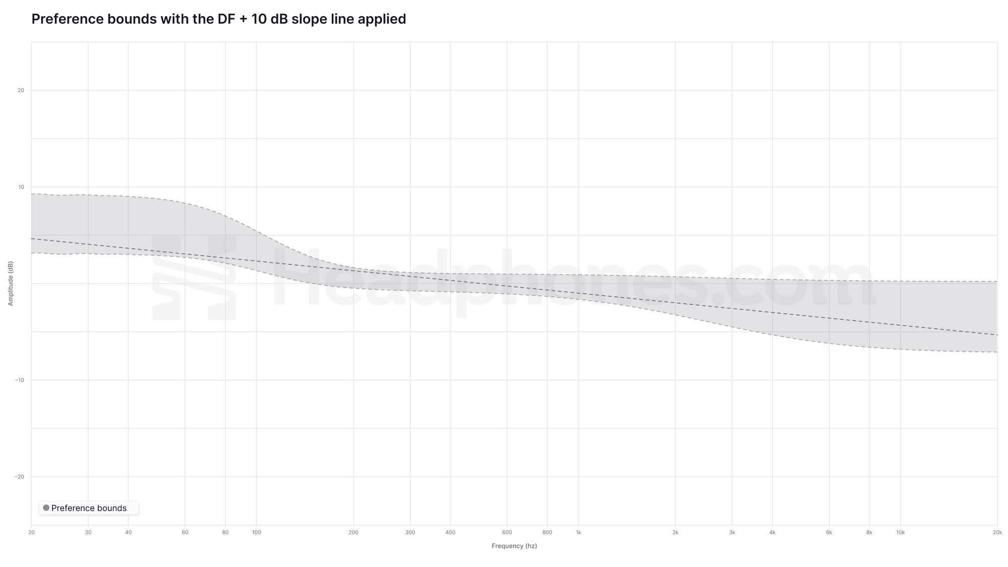
This is a graph of the Sennheiser HD600 measured using a B&K 5128 measurement rig calibrated to the diffuse field (DF) HRTF curve visualized with preference bounds applied and a DF + 10 dB slope overlaid. There’s a lot going on here so let me break it down.
-
This graph is calibrated to the Diffuse Field Head-Related Transfer Function (DF HRTF). The DF HRTF has been established since 1986 as the necessary anatomical baseline when hearing using headphones (sometimes referred to as the ear gain). It is therefore not a “reference” or “target” curve that you would use to create a compensated graph. If the headphone measures identically to the DF HRTF, we will have a flat line. Any deviations will be shown as bumps or scoops in the graph away from this baseline, and if it's a large enough difference, it may be perceived as tonal coloration.
We use the DF HRTF because it represents what a flat speaker would sound at your eardrum if it was placed in a reverberant room where all soundwaves hit your head from all angles and from all directions equally. This is similar to headphones as they are worn on the head and cover your entire ear to begin with, having no specific directivity, unlike speakers where sound comes at you from a specific direction and location (and are affected by room acoustics).
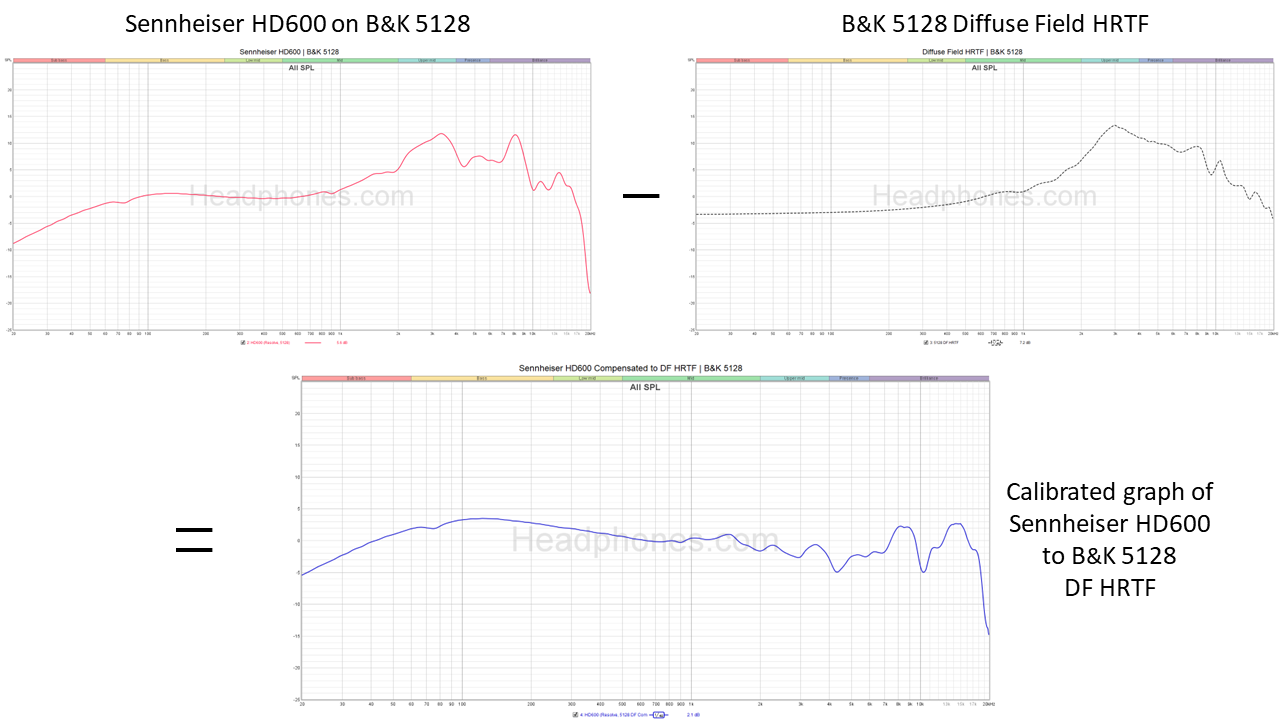
Taking the raw frequency response graph of the HD600 and subtracting the B&K 5128 DF HRTF gives us the calibrated graph. This calibrated graph is effectively the “error curve” of the HD600 where it doesn’t match the DF HRTF and thus looks flattened out compared to the original raw graphs.
- The asymmetrically shaped wide gray bands within the dotted lines represent preference bounds. This is because subjectively, different people will have different preferences in having more bass or less treble, for example. Thus we provide a range of values (that vary per frequency) to reflect this difference in preference. The reason there is an overall downwards slope is because further audio research (from Harman) showed that the majority of listeners prefer a downwards tilt from the bass into the treble when listening to music in a non-idealized room. This finding extends to headphones as well. Effectively, they represent the limits of how much deviation/tonal color a headphone could have that people still found acceptable without the headphone starting to be perceived as imbalanced. Just note that as more research is done, the exact range of these preference bounds may evolve over time.
-
The DF + 10 dB slope is a general approximation of a calibrated DF HRTF with the preference data baked in. You can think of it as a “target curve” if it’s easier to anchor your analysis of the graph but really, it’s a less sophisticated way of showing these preference boundaries. Here it’s visualized from +5 dB at 20 Hz to -5 dB at 20 kHz. You might also see this be written as a “DF + -1.0 dB/octave tilt”. It’s the same thing: there are 10 octaves between 20 Hz - 20 kHz so we end up with a -10 dB downwards tilt by the time we hit 20 kHz.


Confused? Let’s recap. This graph shows the HD 600 compensated to the DF + 10 dB slope “target”.
By contrast, this is what a calibrated graph looks like. This shows the same measurement data, but rather than applying a target compensation, the frequency response is calibrated to the measurement head’s anatomical baseline (i.e. the B&K 5128’s DF HRTF) and shown against the 10 dB downwards tilt that people on average prefer in headphones and in speakers.
Now here is that same data shown with the preference bounds applied. This is identical to the original graph we showed right at the beginning of this section. You can see that the 10 dB slope lies within the bounds, as it is an approximation of listening preferences.
And that concludes the major principles in understanding these graphs. However, there are a few additional notes to keep in mind.
- While the B&K 5128 measurement rig is currently the most accurate system we have to capture the frequency response of a speaker/headphone/IEM at the eardrum, measurements above 10 kHz still shouldn’t be overly scrutinized since this region is highly susceptible to positional variance. So while it is rated for accuracy from 20 - 20 kHz compared to GRAS rigs which are only rated for accuracy up to 10 kHz, the increased accuracy in the upper treble shouldn’t be overblown.
- The DF HRTF calibration has a major trick up its sleeve - it can be used to make measurements done on different rigs compatible. While it may seem that the “more accurate” B&K 5128 would produce similar graphs to GRAS systems but with better lower and high frequencies, it’s not quite that straightforward. Raw measurements simply cannot be compared between systems because, as mentioned, they are effectively different “heads” with different “ears”. Thus, their measurements are inherently different.
But by using the DF HRTF calibration for both rigs, we can actually cross-compare our B&K 5128 measurements to GRAS data. This provides tremendous flexibility as it means that we can actually apply a similar visual presentation to old GRAS measurements. They won’t look identical, since headphones behave differently on different heads, but they will at the very least be comparable with one another. We are in the process of getting a better DF HRTF for the GRAS system to potentially increase this compatibility between systems. Stay tuned for that.
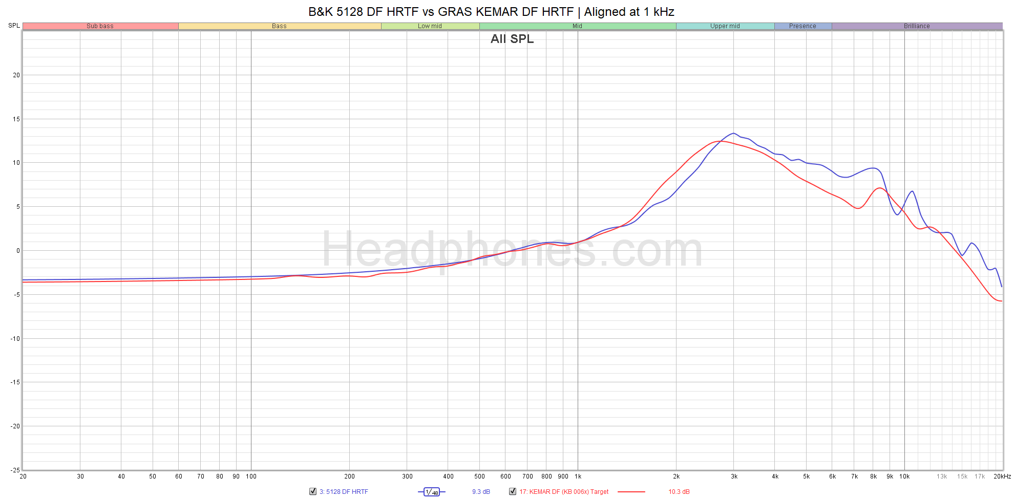
Comparison between the raw DF HRTF between the B&K 5128 and GRAS systems. Each HRTF is correct only for their respective measuring rigs.
- Everything we’ve discussed has been studied in over-ear headphones rather than IEMs. While the same principles apply, there are some meaningful differences with IEMs and how that data needs to be represented. There are two reasons for this: 1) Because the modeled acoustic impedance of the ear is different between the two measurement systems (with this being the most significant improvement on the B&K 5128), you will see this difference in the lower frequencies; and 2) IEMs bypass the pinna, which contributes significant effects to the DF HRTF in the treble.
- DON’T get too comfortable with the DF + 10 dB slope target. It’s only there for convenience sake. The bigger and more important point is that preference bounds are the true representation of what the “target” actually is - a headphone that falls within these bounds will likely be enjoyable to most listeners. These bounds are pulled directly from the established preference groups in Harman’s research.
- With the B&K 5128, you might occasionally see a peak around 8 kHz. This is most likely due to what’s known as a “canal entrance resonance” and in most cases it won’t be heard or be perceptually relevant. On GRAS systems, you’ll often see it as a 9 kHz dip. This is because different systems are effectively different “heads” with different “ears” and thus these effects will show up differently. You can safely ignore them unless a review explicitly states it as a problem.

Interpreting the B&K 5128 Graph
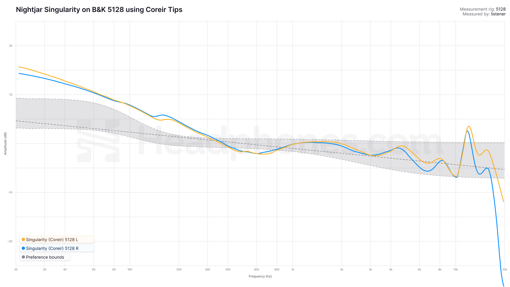
Alright, so we can see that the Sennheiser HD600 is almost dead even in the preference bounds with the exception of the subbass roll-off and some upper treble elevations that just nudges outside the bounds. There’s a reason it’s been long considered one of the best and most neutral headphones out there. Here’s a different graph - an IEM this time. It’s the Nightjar Singularity. You can read my full review of it here but TL;DR: It’s a great sounding dynamic driver IEM with a massive, massive bass boost added. Now let’s talk about how we would read its graph and think about how the frequency response translates into the listening experience.
This is how I would interpret it. Remember: everything I’ve mentioned in the previous section with the GRAS rig when translating measurements to music still apply.
- In general, the Singularity reasonably aligns within the listener preference bounds. This makes sense - a lot of people enjoy listening to the Singularity. Myself included, after I got used to the amount of bass it has.
- The Singularity’s excess bass energy lends it to being described as quite a boomy IEM. Drums and bass notes will sound big and bodied, but potentially bloated. Vocal energy is sufficient due to having enough upper mids but the 1 - 2 kHz vs 3 - 4 kHz balance means it likely emphasizes male vocals rather than females as it loses some of the upper harmonics. When adjusted for the bass volume, vocals will be relaxed in the mix.
- While the Singularity falls mostly within the preference bounds, you still have to look at the overall tuning. It would be easy to misinterpret the graph as the Singularity being a little bassy because it’s just a little outside the gray zone in the bass. This is not correct. You can’t look at each region in isolation - you have to consider the balance between the two. In this case, the Singularity is both on the upper bound of the bass preference and the lower bound of the treble preference. In other words, the overall perception is downtitled and bassy.
- This specific measurement uses a type of tip called the Coreir eartips which has some interesting effects on treble. You can see the effect at 10 kHz as a sharp peak. I would take that peak with a grain of salt. I don’t hear it myself, or at least, nowhere near that extremely.
What About Other Reviewers?
I mentioned that the B&K 5128 rig is now the industry leading measurement system. It will soon be the standard as every large review outlet and research organization starts to operationalize their own rigs. For example, Linus Tech Tips’s Labs, Head-Fi, SoundGuys, and Crinacle.com are some of the most well-known review outlets that now use a B&K 5128 (or an equivalent variant). Harman Research also just acquired a B&K 5128 and are in the process of validating their research on it.
Linus Tech Tip’s Labs B&K 5128. Credit to Linus Tech Tips.
As for all the 711 clone couplers out there… they aren’t going away anytime soon. The measurement aspect of this hobby, particularly with IEMs, exploded on the back of the 711 clones. Graphs were decentralized as a result of cheap measuring rigs. We see that in community resources like Squig.link that collate graphs from all sorts of individual reviewers. Despite the pitfalls that less standardized/lower quality measurements might bring, the value that crowdsourced graphs brings cannot be understated. While the highest quality measurements will now come from a select group of big reviewers who can afford a B&K 5128, they simply can’t measure as many products as the whole community can. So don’t throw out your eye for GRAS graphs just yet. Harman’s research still applies there.
That said, the paradigm shift is well underway. The Headphone Show has spearheaded this new representation of frequency response graphs using the B&K 5128 and many other reviewers have adopted a similar presentation. However, it isn’t a unified effort; nowadays you’ll find various graphs with the standard raw depiction against Harman, raw against DF + 10 dB slope, compensated, etc. regardless if they’re from B&K 5128 rigs or 711 clones. More than ever, it’s critical to take the time to understand what the graph you’re looking at is telling you. Read the title, axes, and legends. Recognize that raw graphs done on different rigs cannot be compared. And if I did my job, this article will have thoroughly equipped you with all the tools you need whenever you come across a new graph.
What’s Next?
So the obvious question on everyone’s minds is: When are we getting a Harman B&K 5128 target? I don’t know. And frankly, I don’t even think Harman knows. In fact, it might not even be a when but an if. But here’s where we see our pièce de résistance - our methodology here will almost certainly be compatible when new preference research is released. From anyone. All we need to do is adjust the preference bounds. By using the B&K 5128’s DF HRTF and calibrating raw measurements to that, we’ve built-in compatibility with new research as it gets conducted. In essence, we’re future-proofed.
As such, this is how to understand graphs - the B&K 5128 edition. Just remember, while graphs can be informative and give a rough idea of how a headphone or IEM may sound, they’re no substitute for the actual listening experience.
TL;DR
If you read nothing else, read this. This is the condensed version of how to understand our visualization of calibrated graphs using the B&K 5128.
-
A calibrated graph is when a raw frequency response of a headphone is compared against the specific DF HRTF for the headphone measurement system being used. Therefore a completely flat line = DF HRTF. This is what a flat speaker in a fully reflective room will sound like at the eardrum (for a specific measuring rig). The DF HRTF is not a “target” curve but rather the necessary anatomical baseline compensation needed for headphones. Hence why we consider it as a calibrated graph rather than a compensated one which is based on a target curve.
-
Research on listening preferences show that people on average tend to prefer an approximate 10 dB downward tilt from bass to treble in both headphones and in speakers. We’ve visualized that as a DF + 10 dB slope (see point 3).
-
The visualized preference bounds (grey bands) are a more complete picture of that listening preference research beyond the DF + 10 dB slope. They show the limits of how much deviation/tonal color a headphone could have that people still found acceptable without it starting to be perceived as imbalances. This is a better visualization than only using the DF + 10 dB slope as listening preferences naturally fall within a range instead of a singular line.
- Thus, headphones that largely fall within these preference bounds are likely to be enjoyable. However, you still have to consider the overall tonal balance to get a fuller understanding of a headphone. For example, if a headphone's frequency response is in the upper limits in the bass and lower limits in the treble, it's going to be a bassy and darker headphone.
If you have any questions about this article or anything else, feel free to ask in our forum or join us over at our Discord server where we have a great community of enthusiasts happy to talk about all things audio. Also check out our reviews here at The Audio Files and over at The Headphone Show on YouTube to stay up to date with all the latest news.
Bonus: Squig.link 10 dB Delta Graphs
If you’re interested in measurements, especially for IEMs, you’ll almost certainly come across something called Squig.link. In essence, it’s an aggregate database of measurements from various reviewers, typically using an IEC-711 clone coupler. Developed by Ryan (AKA Super* Review) before the B&K 5128 gained popularity, it has now evolved with the help of one of Headphones.com’s reviewers, Listener, to incorporate a “10 dB Delta Target”. Though it’s a separate effort to that of what we’re doing here, it is related and an important part of measurements moving forward. You can read Listener’s explanation here over at his article “The Shape of IEMs to Come”.
